A new chart unexpectedly grabbed our attention this week because it has such big implications for the future of the U.S. stock market. Let’s get right to it.
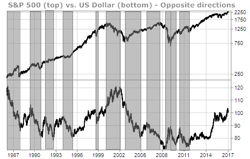
For the most part the USD and the S&P 500 move in broadly opposite directions. Stocks in the S&P 500, just like gold and oil, are priced in USD. When the USD is increasing in value, it takes fewer U.S. dollars to buy assets priced in US dollars … so the prices of those assets tend to fall.
Below is a comparison chart of the S&P 500 and the USD for the past 30+ years. The gray highlighted areas show the times when these two important assets were moving in opposite directions from one another.

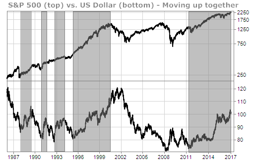
There are also times when the S&P 500 and the US dollar both move up together. These are usually times of economic recovery … when everything is going right. The chart below highlights such times over the past 30 years.

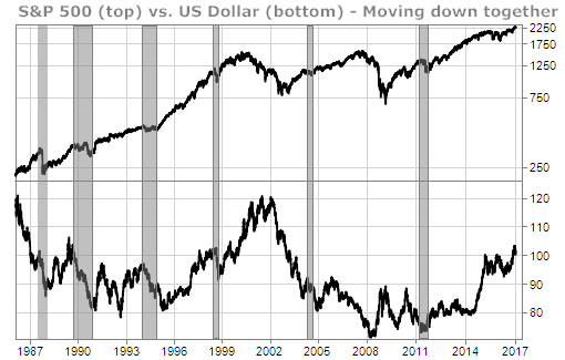
What’s extremely uncommon, however, is to see both the S&P 500 and the US dollar moving down together. That has only happened a handful of times over the last 30 years … as seen in the gray highlighted areas of the chart below.

What’s striking about the times when both the S&P 500 and the USD are moving down together is that they haven’t lasted long … and the stock market has been significantly higher shortly thereafter.
Why does that matter? Because we’ve been telling you for the past month that we expect both the U.S. dollar and the S&P 500 to start downward corrections by late January or early February.
If we do see both the USD and the S&P 500 correct over the next few months, we’ll be eagerly awaiting the start of a new rally in the S&P 500 because we think it could be a very powerful one.
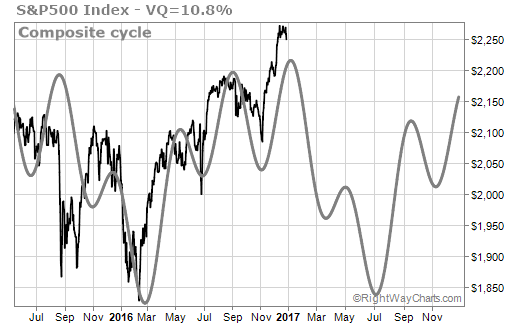
Our time cycles analysis on the S&P 500 suggest we could see that rally start to unfold by the middle of this year.

Waiting patiently,
TradeSmith Team


