As we all know, stock market volatility made a big comeback last month after a long absence. The February volatility surge had us waiving the caution flag while also emphasizing a “wait and see” approach.
Indeed, the US stock market did come roaring back… but today we’re seeing more and more signs of internal market weakness… and more and more reasons to start building up some cash reserves.
The Dow Jones Industrial Average in particular is a concern here. We looked at price data for the components of the Dow Jones Industrial Average dating back to 1997 (more than twenty years).
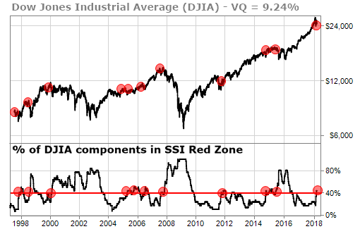
What we found was that, when 40% or more of the Dow’s components are in the Red Zone according to our TradeStops SSI system, there is high likelihood of a moderate to serious correction.
The table below shows what happens after 40% or more of the stocks in the Dow are in the SSI Red Zone (with data going back to 1997).
| Symbol | 40% Stop Out Date | Maximum Decline |
|---|---|---|
| DJIA | 1/7/1998 | -6.46% |
| DJIA | 8/25/1998 | -14.22% |
| DJIA | 2/18/2000 | -29.73% |
| DJIA | 4/29/2005 | -1.68% |
| DJIA | 9/23/2005 | -3.08% |
| DJIA | 7/14/2006 | -0.75% |
| DJIA | 11/12/2007 | -50.41% |
| DJIA | 11/25/2011 | -0.35% |
| DJIA | 10/17/2014 | -1.60% |
| DJIA | 1/12/2015 | -3.42% |
| DJIA | 6/16/2015 | -14.15% |
| Average: | -11.44% | |
From the point in time when 40% or more Dow components are stopped out, the average decline is another 11.44%.
40% of the DJIA components officially entered the SSI Red Zone February 22, 2018.
The chart below shows the trigger points for this 40%-stopped-out condition.

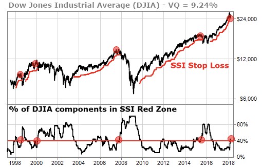
Out of the 11 times in the past 20 years that we got this condition, there were 4 times when the DJIA itself was also in the SSI Red Zone. The table below shows what happened (again since 1997) the 4 times that we had the 40%-stopped-out condition along with the DJIA itself being in the SSI Red Zone.
I must warn you: The numbers are far more grim…
| Symbol | 40% Stop Out Date | SSI Stop Out Date | Maximum Decline |
|---|---|---|---|
| DJIA | 8/25/1998 | 10/27/1997 | -14.22% |
| DJIA | 2/18/2000 | 2/25/2000 | -29.73% |
| DJIA | 11/12/2007 | 11/21/2007 | -50.41% |
| DJIA | 6/16/2015 | 8/21/2015 | -14.15% |
| Average: | -27.13% | ||
When both of the conditions are met – the 40% threshold for Dow components and the Dow itself stopped out via SSI – the average decline over the past twenty-plus years has been 27.13%. That is full-fledged bear market territory.
The chart below highlights the periods during which both of these conditions were in place.

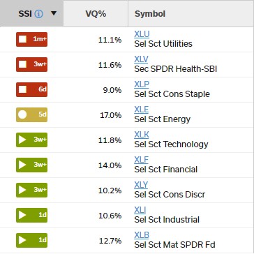
Our nine-sector ETF strategy echoes this message too. With only six of nine ETF sectors active right now, our ETF strategy is not rebalancing the portfolio. Instead, stopped-out positions go to cash.


