Last week we debunked the popular “best days” argument from Wall Street.
To quickly recap, Wall Street wants individual investors to buy and hold… so they can collect as many fees as possible… and they convince investors to buy and hold by saying that, if they aren’t always holding, they’ll miss the “best days” of the market.
What Wall Street conveniently left out was that, most of the time, the “best days” are followed by ugly bear market declines.
Why does this happen? Because bear markets show more volatility in both directions.
As a general rule, the biggest bounces occur in bear markets. But the biggest drops and the most painful declines are in bear markets too. (That’s why they are bear markets!)
This means that, if you try hard to capture the “best days,” that is to say the biggest upside days… then you will have to be long in the midst of harsh bear market trends… which means you capture the worst days too. That tends to defeat the whole point.
To further confirm this idea, we did even more historical research. In fact, we went all the way back to 1900.
The TradeStops Volatility Quotient, or VQ, is a measure of volatility over a 12 to 36-month time frame. So, we asked a question: “What happens to the Dow after it moves higher by at least ½ VQ in a week’s time?” (Statistically, that is a huge upside move.)
Here is what we found out:
Since the year 1900, a ½ VQ move in the Dow… in the space of a week or less… has happened 129 separate times.
In 97 of those 129 instances… or more than 75% of the time… the move happened when the Dow was in the SSI Red Zone

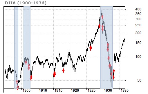
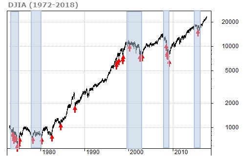
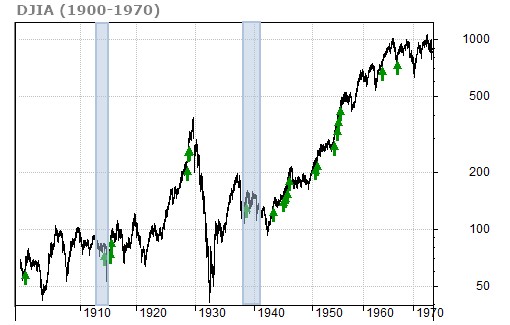
The charts below break up the past 118 years of Dow Jones history into three different periods so you can see more clearly the market context in which all these “big upmoves” occurred.
These charts show all the big upmoves that occurred when the TradeStops SSI was in the Red Zone. We’ve highlighted the bear market periods with blue shading.
From 1900 to 1936, more than half of the Dow’s big upmoves (54%) were “dead cat bounces.” (A dead cat bounce is a sharp rebound followed by further painful decline.)

From 1936 to 1972, it was even worse. In this time period, more than two-thirds of all large upmoves (71%) were dead cat bounces (followed by painful declines).

The evidence is clear for big upmoves that happen in the SSI Red Zone:
- The market’s biggest upmoves tend to occur in bearish periods.
- In SSI Red Zones, upmoves tend to be “dead cat bounces” followed by decline.
- Investors are better off avoiding these periods (not trying to catch “best days.”)
We then asked ourselves another question: What about big upmoves that occurred with the TradeStops SSI in the Green Zone?
Answer: In the SSI Green Zone, the Dow’s upmoves were usually followed by gains. Take a look.
Between 1900 and 1970, a majority of the Dow’s upmoves in SSI Green Zones saw higher prices afterward (thus rewarding investors who were long).

We saw the same thing again in the 1970-2018 period. In SSI Green Zones, the Dow’s big upmoves were favorable (rather than dead cat bounces).

The simple conclusion: Capturing the “best days” of the market doesn’t matter. What really matters is sticking with the SSI Green Zone… and staying out of the Red Zone.
- In SSI Red Zones, the big upmoves (containing Wall Street’s beloved “best days”) are more likely to be dead cat bounces leading to further downtrend.
- In SSI Green Zones, a big upmove is more likely to be near-term rewarding.
You shouldn’t care about “best days” – in other words. With no offense to feline lovers, a lot of those “best days” are dead cats!
Why doesn’t Wall Street provide analysis like this? Because, again, Wall Street’s main concern is collecting fees.
That means getting investors to stay in the market as much of the time as possible… which means keeping them in during bear market declines.
We would rather see you be as successful in your investing as possible… even if that means lower fees for Wall Street.


